[Digging through the archives again… originally published as “subway my way” on 11 Aug 2007. Was that really 4 years ago?? As always, I’ve updated a few items to reflect changes since then.]
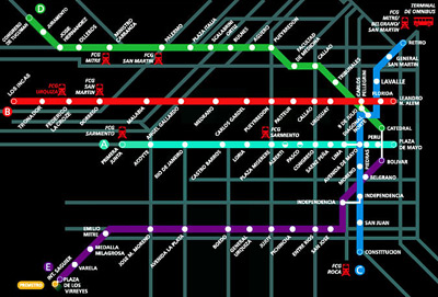
There may not be much anyone can do about the slow pace of subway construction in Buenos Aires, but how we visualize the network can be easily improved. The firm Diseño Shakespear came up with the subte map used for most of the 00’s. With a black background, it was like some early-80’s vision of BsAs… a bit scary & not particularly useful:
As far as other subway systems go, the London map was the beginning of an era because it’s beautiful and functional. Thank you, Harry Beck. Eddie Jabbour redesigned the NYC subway map in his free time & came up with some brilliant results. Madrid’s subway is growing to match the flight to the suburbs… I can hardly believe it’s the same system I took on my first trip there in 1998. The old map was almost impossible to read quickly, so a new design was adopted in 2007. If Buenos Aires wants to keep company with these other world-class cities, its subway map should be up to the challenge.
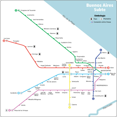
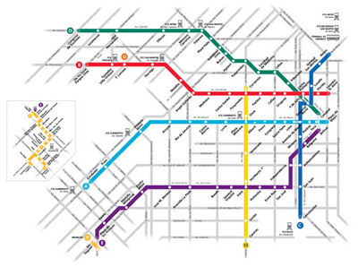
I decided to use the Madrid map as a base for a different way to look at the BA subte system:
First of all, I’m not a graphic designer & I focused more on the system than the overall look of the map. So this is only a beginning. Also, I changed the names of a lot of stations… hey, it’s my map 🙂
I began by overlaying the real routes over a city map. Then I cut curves as much as I could. The red B Line could be simplified between Angel Gallardo & Los Incas. Ditto for the green D Line between Pueyrredón & Tribunales. But I believe showing those curves helps orient to the street plan.
I also wanted to show how the city is contained by two rivers. The length of each line is clearly visible as well as the relationships between them. Light grey street names along certain routes like Eddie Jabbour did for NYC would be a good improvement for a future version.
The following changes are based on politics rather than graphic design…
Interconnecting stations share the same name. It’s not a difficult concept. Look where I labeled 3 stations as “Microcentro.” The current system calls them by different names (Catedral – Perú – Bolívar) although they are all connected by an underground walkway. Time to change that.
No current station refers to the Obelisk. How can that be? Of the 3 connected stations at that spot (Carlos Pellegrini – Diagonal Norte – Avenida 9 de Julio), you’d never know you were underneath one of the most recognized symbols of Buenos Aires. Call it Obelisco & be done with it.
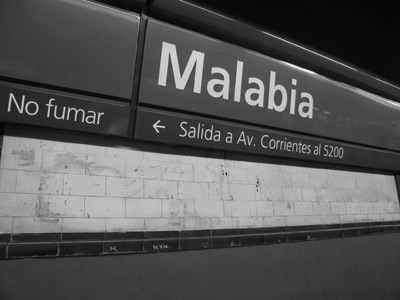
I’ve changed the names of a few more things, but you get the point. Two stations are named “Moreno” & “José M. Moreno.” Very different people but too similarly named. Changing the names of stations is easy to do, & careful observers can see it’s been done before… Malabia used to be called “Canning.” Look at the tiles… squint if you have to:
Fortunately since the first appearance of this post, the subway map has been improved & Diseño Shakespear made it more user-friendly:
But while I appreciate the look of the new signage installed in 2006-07, the network as a whole needs to be considered… past & future stations alike. In the meantime, I’ll continue to read enelsubte.com & viajar como ganado. Love that expression.
I like it! Your version is definitely cleaner than either of the 2 other designs – I’ve never liked how they have the main street names on it – it’s unnecessary and clutters everything up. I also totally agree with the change in names that one station has 3 names is frankly ridiculous, although not sure about the law that no one city has more than one station with the same name, didn’t stop them with Callao & Pueyrredon! You changed the B Line Pueyrredon (nice new name by the way) but you still have the 2 Callao stations – maybe the D Line one could be changed to Cordoba? Overall though, I definitely think you’re on the right lines!
Thanks! The system isn’t as well thought out as it could be, probably from being built by different companies. And I’m glad you caught that mistake… slipped right by me last night.
Naming stations for major streets is ridiculous, especially when several lines cross a single street. Like you mention, if you say to a friend “I’ll meet you at Pueyrredón station,” it could mean two things. Not good. I’ve been on lots of subways & can’t recall one with such a crazy naming system. Saludos!
I like your version!
And I also like your renaming suggestions. (Specially the one in Pueyrredón)
Personally, I think that Catedral-Plaza de Mayo-Bolívar, and Diagonal Norte-Pellegrini- 9 de Julio should be rebuilt and made into unified stations, like in DC’s Metro. (the same could be said about Once, and soon, about Retiro). I think that was te original plan anyway, at least in Plaza de Mayo.
Sadly, we’re light years away of that kind of urban design, but it should be considered before further expanding of the Subte. (should that ever occur)
Thanks! “Quilombo” is the only thing I could think of for that area 🙂
That’s a great suggestion… the connections between those groups of 3 stations are horrible & confusing to first-time riders. They could make them more open & more level, for sure. DC’s metro is really interesting. A bit dark & lots of concrete but the system works very well.
I know… I imagine the day when people will look back on photos from now & think, “how did they ever get around in that mess?” Abrazo!